Not a special edition week but the Pantone Color of the Year was just revealed and I wanted to highlight the past five years and give a little background on why designers and artists look forward to this every year.
ABOUT PANTONE COLOR OF THE YEAR
“For over 20 years, Pantone’s Color of the Year has influenced product development and purchasing decisions in multiple industries, including fashion, home furnishings, and industrial design, as well as product packaging and graphic design.
The Pantone Color of the Year selection process requires thoughtful consideration and trend analysis. To arrive at the selection each year, Pantone’s color experts at Pantone Color Institute comb the world looking for new color influences. This can include the entertainment industry and films in production, traveling art collections and new artists, fashion, all areas of design, popular travel destinations, as well as new lifestyles, playstyles, and socio-economic conditions. Influences may also stem from new technologies, materials, textures, and effects that impact color, relevant social media platforms and even upcoming sporting events that capture worldwide attention.”
Check out Pantone for more info.
~~~
PANTONE 17-5104 Ultimate Gray + PANTONE 13-0647 Illuminating (2021)
“PANTONE 17-5104 Ultimate Gray + PANTONE 13-0647 Illuminating, two independent colors that highlight how different elements come together to support one another, best express the mood for Pantone Color of the Year 2021. Practical and rock solid but at the same time warming and optimistic, the union of PANTONE 17-5104 Ultimate Gray + PANTONE 13-0647 Illuminating is one of strength and positivity. It is a story of color that encapsulates deeper feelings of thoughtfulness with the promise of something sunny and friendly.”


PANTONE 19-4052 Classic Blue (2020)
“A timeless and enduring blue hue, PANTONE 19-4052 Classic Blue is elegant in its simplicity. Suggestive of the sky at dusk, the reassuring qualities of the thought-provoking PANTONE 19-4052 Classic Blue highlight our desire for a dependable and stable foundation on which to build as we cross the threshold into a new era.”


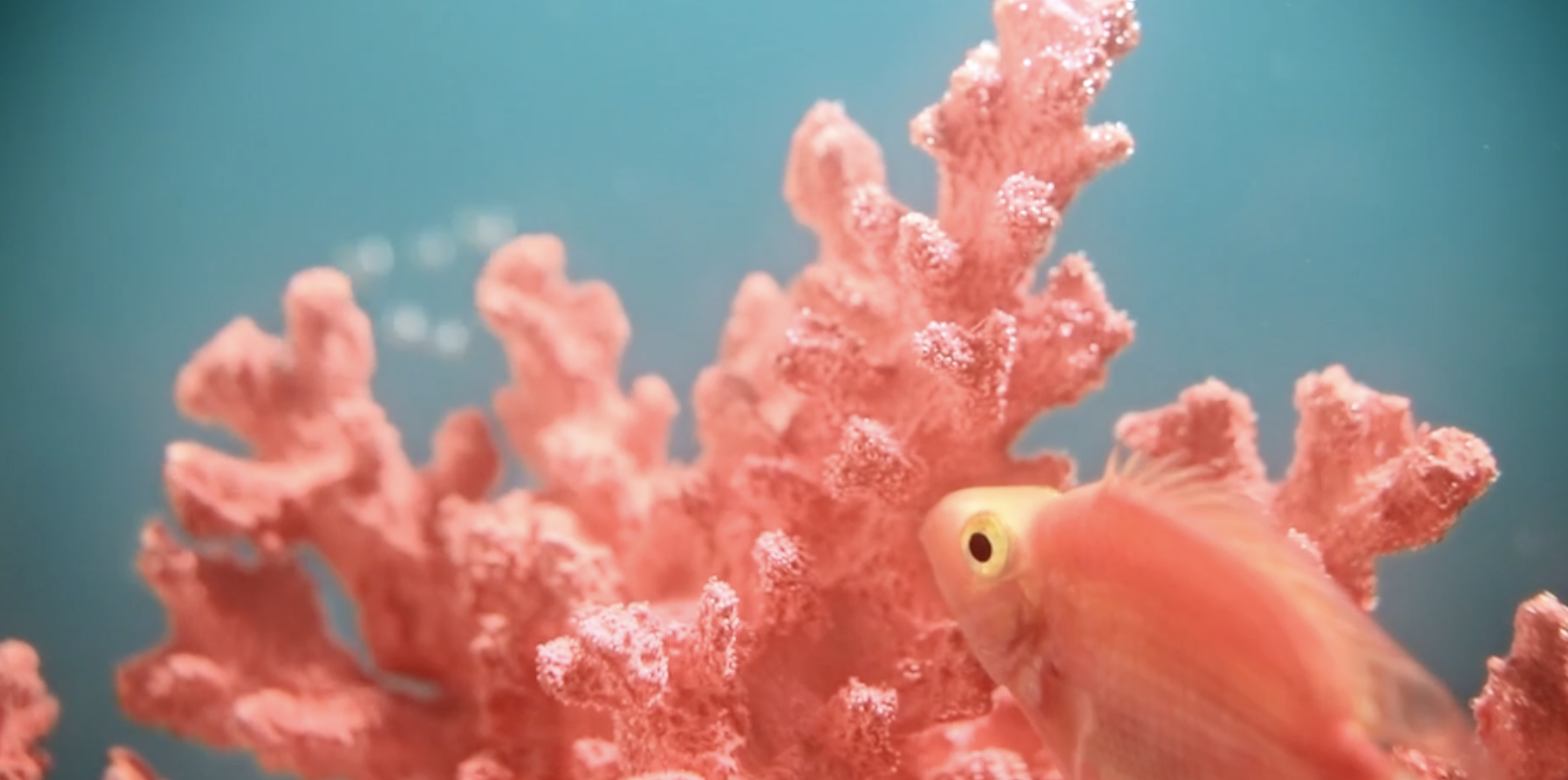
PANTONE 16-1546 Living Coral (2019)
“Vibrant, yet mellow PANTONE 16-1546 Living Coral embraces us with warmth and nourishment to provide comfort and buoyancy in our continually shifting environment.”


PANTONE 18-3838 ULTRA VIOLET (2018)
“A dramatically provocative and thoughtful purple shade, PANTONE 18-3838 Ultra Violet communicates originality, ingenuity, and visionary thinking that points us toward the future.
Complex and contemplative, Ultra Violet suggests the mysteries of the cosmos, the intrigue of what lies ahead, and the discoveries beyond where we are now. The vast and limitless night sky is symbolic of what is possible and continues to inspire the desire to pursue a world beyond our own.”


PANTONE 15-0343 GREENERY (2017)
“Greenery is a fresh and zesty yellow-green shade that evokes the first days of spring when nature’s greens revive, restore and renew. Illustrative of flourishing foliage and the lushness of the great outdoors, the fortifying attributes of Greenery signals consumers to take a deep breath, oxygenate and reinvigorate.”


